Recently I’ve been inspired by these calming spaces in a muted colour palette, with warmth and texture from natural materials such as wood, stone, copper, ceramic and linen.
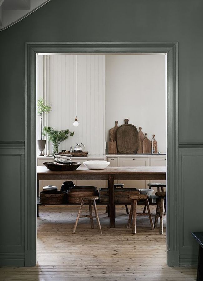
Painting the outside wall of the space and removing the kitchen doors makes for an impactful frame around a soft, warm kitchen. The collection of old cutting boards stood on the worktop ties in the wooden table to the fitted kitchen, whilst adding warmth and patina.
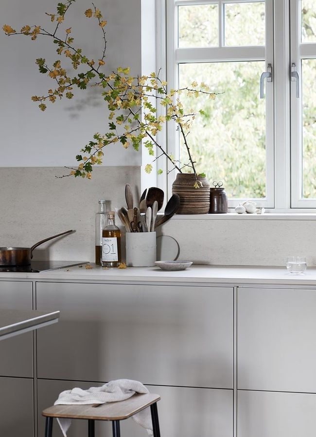
Having handle less drawers allows the kitchen units to fade into the wall, making the most of a smaller room. The worktop continues up the wall, removing the need for a backsplash and making the kitchen really feel part of the space.

The single pendant light hanging down from the high ceiling here adds all the drama this kitchen needs. By recessing the units and worktop back into the wall, the kitchen has a feel of being a separate part of the space whilst keeping the layout open plan.

This double layered shelf allows for the visual space created by having no upper cabinets, but without losing functionality. Being used both to store crockery and for decorative touches such as the vintage scales, the shelves are painted the same colour as the door fronts to keep it cohesive.

This kitchen also has no upper units, keeping the feel minimalistic. Here they have installed a simple pipe with s hooks, to hang a selection of everyday kitchen utensils; creating both a functional and aesthetically pleasing backdrop.
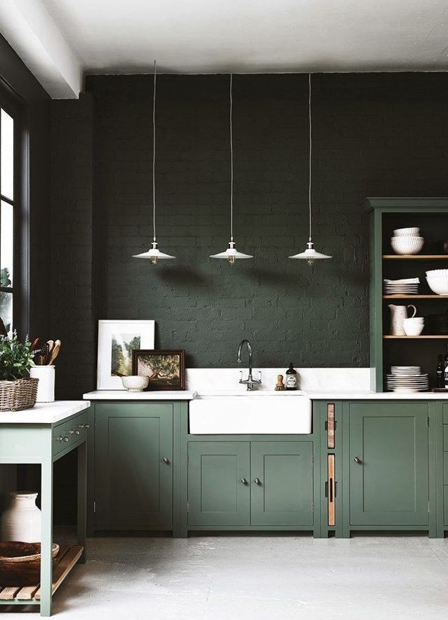
By painting the walls a similar shade to the cabinets, the worktop and butler sink stand out - lightening up what would otherwise be a dark space. The group of three pendant lights hanging down echo the tones of white and add interest to the empty wall by being slightly offset from the centre of the sink.

The door fronts in this kitchen are painted a very soft green, a welcome change from all the grey kitchens that have been popular over recent years. The green brings a freshness and stillness into the space, which works effortlessly with the other tones.
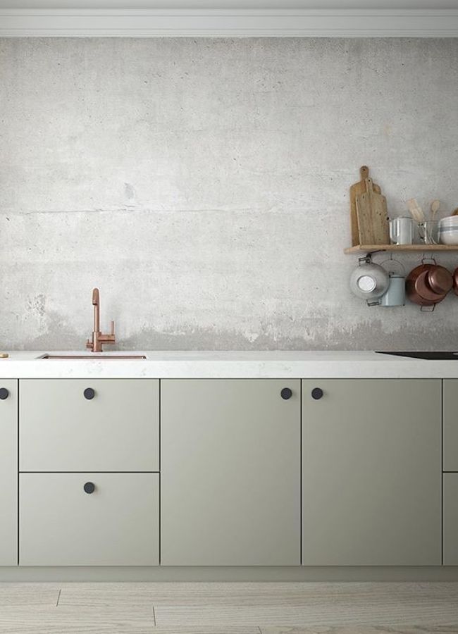
The patina on the wall steals the show in this kitchen with just the bare essentials. The copper tap and saucepans bring an element of warmth into the otherwise cool space, and the dark cupboard handles add contrast.

Here, the double layered shelf is used as a place to display a few curated objects. The leather strap used as a bracket changes things up a little, giving the kitchen an elegant feel.

This kitchen is minimal almost to the extreme, with simple white units and worktop. The warmth of the wood tones add detail to the space, while it is the floor to ceiling linen curtains stealing the show here. An unusual feature in the kitchen, they add a touch of colour and soften what would otherwise be a cold space.
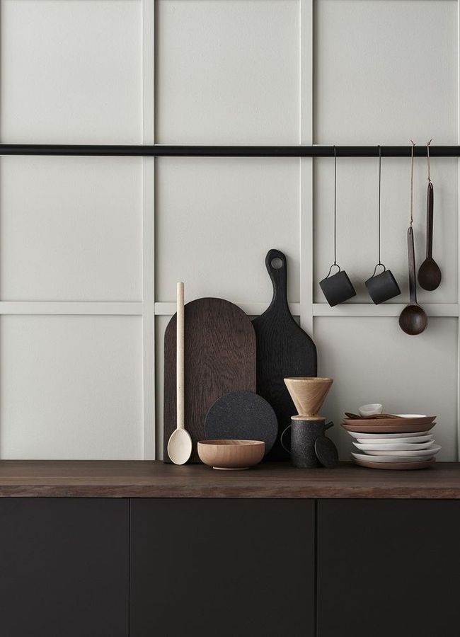
The panelling in this kitchen in place of a splashback adds an interesting touch, highlighting the shadows from the natural light. By placing the dark pipe along the panel, it blends into the space while adding contrast; echoing the colour of cabinets below.

The open shelves are aligned with the base of the extractor hood, creating a feeling of space in this kitchen. Notice how the left side by the window is filled with white crockery, whilst the darker side on the right of the kitchen holds mainly black crockery, emphasising the movement of light throughout the space.

This otherwise pale kitchen is brought to life by the copper warm accents, from the bowl of the sink and the faucet, to the minimal pendants, copper racks and vintage pans. The space left by not having any upper cupboards brings a sense of freshness, allowing the light to shine on the tiled wall.

Leave a comment